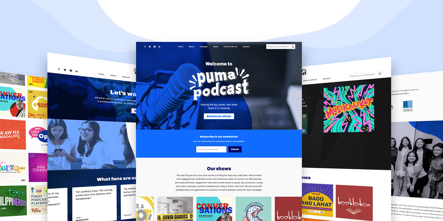
Simplifying the podcast binge-listening experience
PumaPodcast is a Philippine-based podcast production company that produces high-quality audio content covering various topics such as politics, culture, history, and social issues. They specialize in producing narrative-driven podcasts that aim to educate, inspire, and engage audiences.
I had the opportunity to assist in the redesign of PumaPodcast's website under Fieldwork Studio, a digital product design studio. In this project, I was responsible for creating a brand identity, developing a user-friendly interface, and building a responsive website using Webflow.
Problem statement
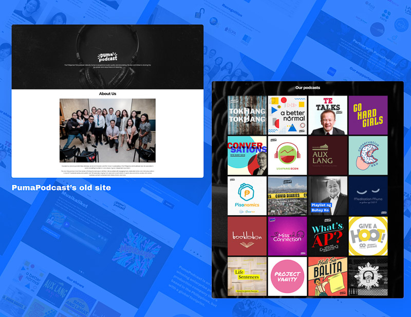
PumaPodcast faced a major challenge as their
listeners were spread out across various third-party
applications such as Spotify, Apple Podcasts, and
Google Podcasts. This made their website
almost irrelevant, as listeners preferred accessing
PumaPodcast's shows through these platforms. Our
task was to find a solution to re-engage listeners and
provide them with a seamless listening experience on the
website, tailored to their preferences while also being
consistent with PumaPodcast's
brand.
Furthermore, the website had been
neglected due to the time-consuming process of adding
new content to the site's content management system
(CMS). This resulted in an outdated website that failed
to meet their listeners' needs. To tackle this
issue, we decided to build a new site using
Webflow's client-friendly CMS, making maintenance
easier and more efficient, ensuring the website is
future-proof.
Target audience

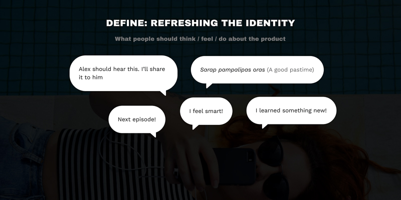
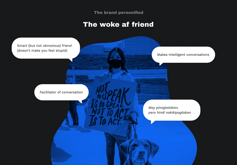
PumaPodcast set their sights on a particular type of listener - those who possessed an insatiable curiosity about the world. These were the socially conscious, the woke, the individuals who yearned for insightful discussions and stimulating content. With this distinct target audience in mind, PumaPodcast endeavored to establish a personal bond with their listeners and differentiate themselves in a saturated podcasting arena.
The challenge
How might we create a trustworthy brand image for PumaPodcast?
How might we encourage users to binge-listen to PumaPodcast’s shows?
How might we streamline the content management process for PumaPodcast's website?
Creating a trustworthy brand image
To ensure the brand's credibility and legitimacy, we took the lead in refreshing its appearance via the website. With the brand's shows mainly centered around political and factual information, we understood the importance of creating a visually stimulating image that would leave a lasting impression on the viewers. Thus, we prioritized building a visual language that effectively conveyed the brand's authority and expertise, ensuring that it struck a chord with the intended audience.
Stylescapes
Two stylescapes were created to align with the client on the design direction they wanted for PumaPodcast.
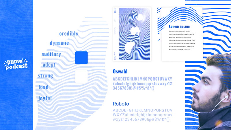
"Movers and Shakers" used the wave as a graphical element to communicate the show's audio production identity, dynamism in various topics, and adeptness in current affairs.
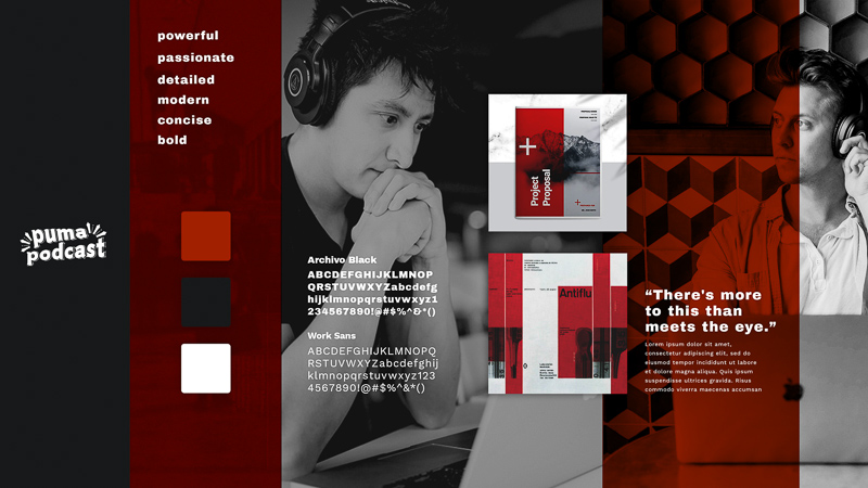
"Truth Unravelers" used the color red as an overlay to black and white imagery to signify the show's detailed examination of matters and advocacy. The direction's tone is informative and concise, casting a spotlight on what is of utmost importance.
Style guide
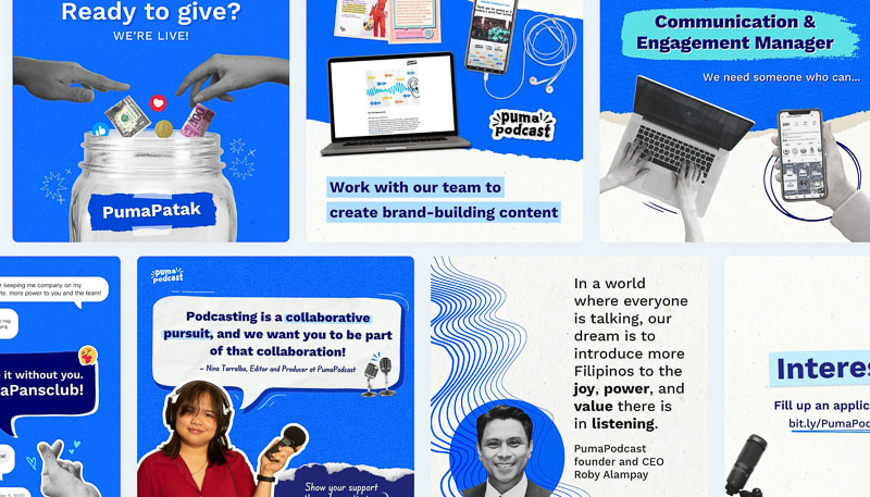
After presenting two stylescape explorations to the client, they chose the 'truth unravelers' direction. However, they expressed concern that the color red was too intense and overpowering. To address this, we opted for the blue color from the 'movers and shakers' direction to ensure the client's brand remained impactful but approachable.
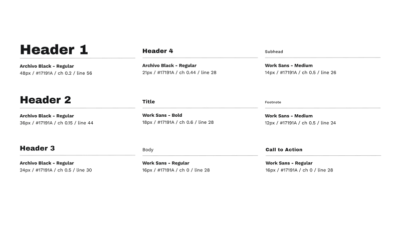
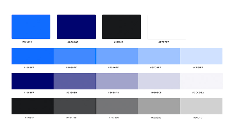
As an end result, the brand refresh made a complete transformation of the visual identity through a new color scheme and typography. This overhaul brought the website design in sync with the brand identity, while the consistent usage of these new brand elements created a unified and trustworthy appearance, ultimately cementing the brand's credibility.
Encouraging binge-listening
To make sure the website’s structure has enough cues to encourage binge-listening, we created an action plan for the sitemap and wireframes to achieve our project goals. Our primary aim was to create a seamless experience for our users that would encourage momentum and minimize any sense of overwhelm. To achieve this, we decided to keep the user experience simple and straightforward, with clear calls to action to help them discover other shows. We also sought to keep them engaged by dropping visual cues of the shows PumaPodcast has repeatedly. We prioritized creating a warm, engaging, welcoming, and intuitive experience, which would reflect the PumaPodcast brand identity. Keywords that informed our design decisions included "warm," "engaging," "welcoming," and "intuitive.”
Streamlining the website’s CMS
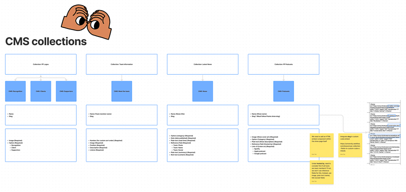
To ensure the website was easy to maintain, we began by planning which elements and content would require frequent updates. Since PumaPodcast adds new shows regularly, we needed to provide them with a quick and easy way to update their site with every new release. With Webflow's user-friendly CMS interface, we created a simpler and more accessible backend system that even non-technical team members could navigate.
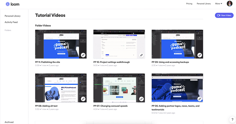
The site redesign proved to be a successful solution for PumaPodcast's challenges, as it brought forth numerous opportunities for growth and success. Firstly, restructuring the site enhanced their SEO presence, allowing them to reach more listeners and expand their audience. Secondly, refreshing the brand's look through the new site helped establish their legitimacy and credibility in the industry. Finally, having a centralized platform to showcase all their materials further strengthened their credibility, building a loyal and engaged listener base.
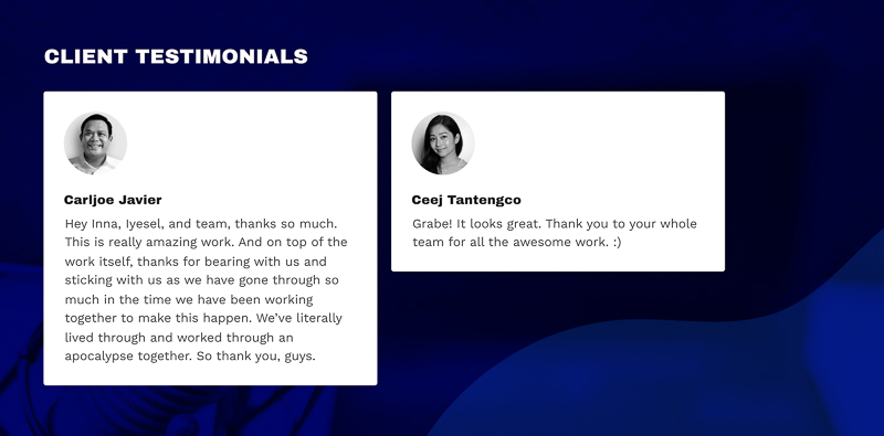


You can view the redesigned website at www.pumapodcast.com
the next big thing!


